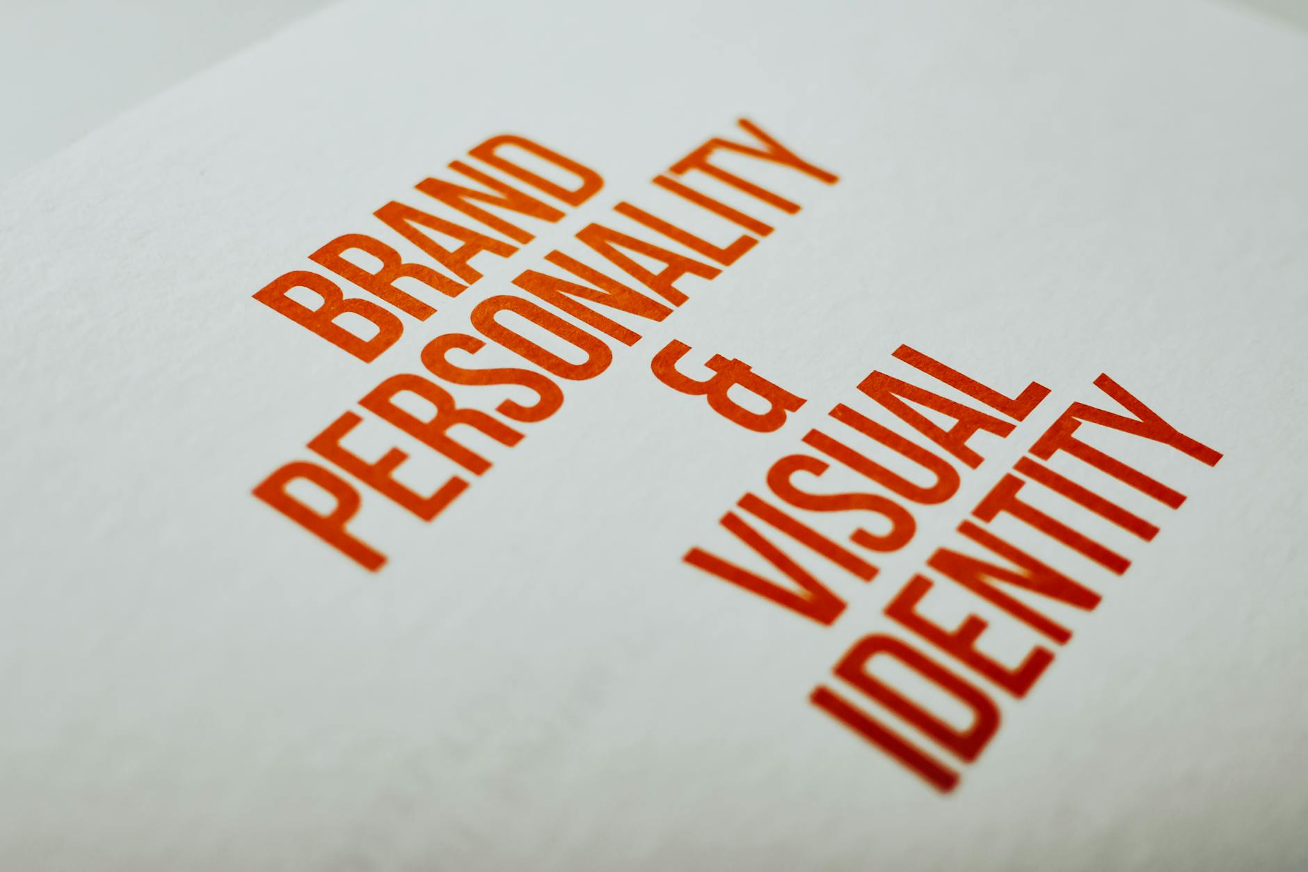
Brand systems
IdentityTypography, spacing and mark usage brought together in a calm visual language.
Portfolio
Rahul Sharma creates branding and visual communication with a clean, modern approach. The work here is shaped to help ideas feel clear, memorable and easy to recognize.

Visual direction
Brand studies, printed marks and color decisions in one place.
Work
Each image suggests the kind of brand thinking Rahul brings to a project: disciplined typography, balanced composition and a clear visual system that can hold together across touchpoints.
Typography, spacing and mark usage brought together in a calm visual language.

Editorial spreads and presentation pages with clear rhythm and quiet contrast.
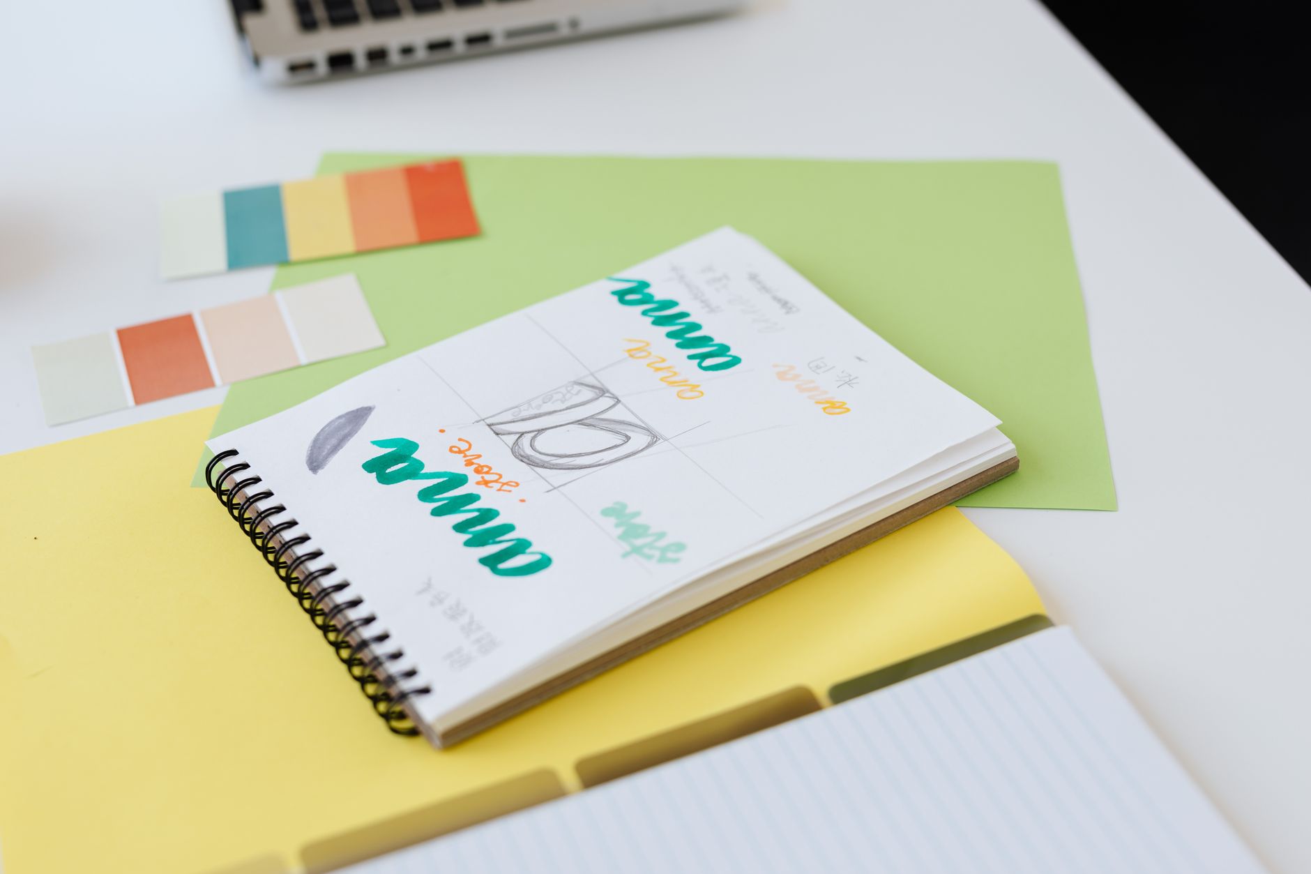
A measured mix of material references, type, and color cues that keep the work cohesive.
Approach
The images here lean into materials, surfaces and composition so the visual system feels grounded in the work itself, not in decoration.
Branding
Layouts are kept direct and balanced so the message stays clear when a brand moves from a screen to paper.
Visual language
The palette stays restrained so hierarchy comes from spacing, contrast and thoughtful composition.

Studio notes
A quiet surface for working through type, spacing and mark ideas.